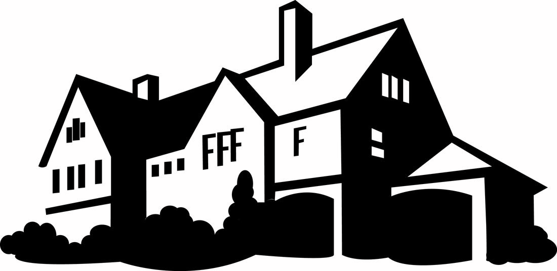
House Project-
For this project we made an outline of a picture of a house. I mainly used the pen tool and the eclipse tool to create all everything in this image. I think that this project could have turned out better if I had had more experience with illustrator before making this house. The font used for the windows is not the best and the overall outline of the house is not the best. I think I did a good job making the bushes.
For this project we made an outline of a picture of a house. I mainly used the pen tool and the eclipse tool to create all everything in this image. I think that this project could have turned out better if I had had more experience with illustrator before making this house. The font used for the windows is not the best and the overall outline of the house is not the best. I think I did a good job making the bushes.
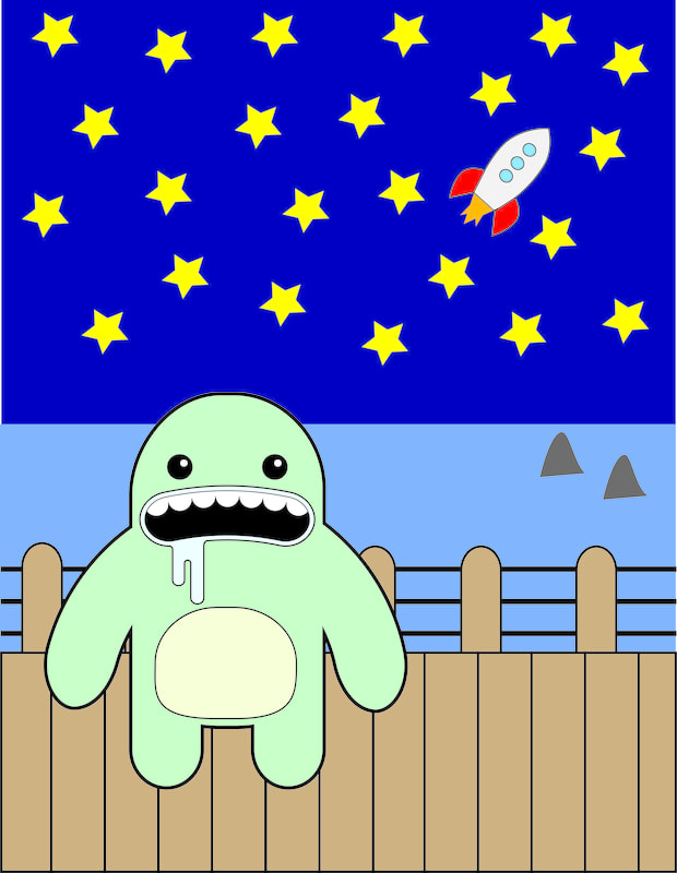
Vector Creature:
This is my victory creature. For the project I wanted to create something fun, after creating the the original creature. I think I could have done a better job on the dock, making it seem more realistic, the dock right now looks like its just straight up and down and the creature is holding on to it. I think the rocket ship I mad in the sky is pretty cool though.
This is my victory creature. For the project I wanted to create something fun, after creating the the original creature. I think I could have done a better job on the dock, making it seem more realistic, the dock right now looks like its just straight up and down and the creature is holding on to it. I think the rocket ship I mad in the sky is pretty cool though.
Logo:
For this project we were supposed to design a logo. I thought of doing one for a coffee house because it would be simple and easy, I just looked up a local shop and made a logo. Overall I think this logo turned out really well, I like the color scheme, and I just think everything flows together really well.
For this project we were supposed to design a logo. I thought of doing one for a coffee house because it would be simple and easy, I just looked up a local shop and made a logo. Overall I think this logo turned out really well, I like the color scheme, and I just think everything flows together really well.
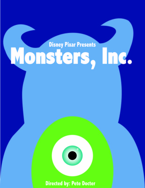
Minimalist Poster:
For this project we were supposed to make a poster. When I did my research on minimalist posters a lot showed up for disney movies, so I decided thats whatI wanted to do. I've always been a fan of Monsters Inc. so I created a poster for the movie. This is my favorite project I made in this class. Its very simple, but I really like how it turned out. I like the concept of the whole poster and I think it all just goes together really well. I do think I could have done a better job on the outline of Sully.
For this project we were supposed to make a poster. When I did my research on minimalist posters a lot showed up for disney movies, so I decided thats whatI wanted to do. I've always been a fan of Monsters Inc. so I created a poster for the movie. This is my favorite project I made in this class. Its very simple, but I really like how it turned out. I like the concept of the whole poster and I think it all just goes together really well. I do think I could have done a better job on the outline of Sully.
